Worthwhile?

So, we’re well into the book now, significantly past the halfway point, and chances are that if you’ve put in the time and effort to get this far, you won’t be turning back. I am curious whether anybody else is finding the length of the book, and especially of some passages, to be taxing.

I find that the portions of the book that take place in boardrooms and offices or on the phone between people situated in these locales get old pretty quickly. Gaddis really beats the horse to death and back again. I don’t know how many pages of this stuff we get, but it takes only a couple of good long scenes of this sort of satire for me to get the point. Yet he keeps hitting us with it at great length, and I can tell you (having finished the book a bit early the other night) that it doesn’t really let up. So why does he do it?

Well, maybe it’s a matter of pacing, for the other thing he really rams down our throats is the anger and bitterness that Gibbs and Eigen express as they try to make it through their grubby workaday lives while abandoning (or being abandoned by) the writerly pursuits they think are worthwhile. If he didn’t give us a comic (if infuriating) break from these sections, we’d all pull a Schramm.

And then of course there’s poor Bast, stuck between the two godawful types of scene.

It’s at about this point in the book that I tend to become almost overcome with despair, for though it is the kind of book that leaves you clutching your belly with laughter, it’s also a ghastly work of hopelessness. Take for example this forecast from page 359:

See he worked here [says Norman Angel] for a while just before I came, just real brilliant but, I don’t know but just to give you an idea, one time when we’d all three had lunch and he’d taken a few drinks a bum came up to us on the street with his hand out and the wind blowing his torn coat, a whole wreck of a man that couldn’t hardly see us anyway, but Jack all of a sudden reached out and gave him a dollar and that really, well you know a long time after that I said something about it once to Stella and all she said was she said he did it because what he saw coming toward him was himself.

What an outlook for poor Gibbs, and it doesn’t seem at all off the mark.

This is a book about art and artists. If what Gibbs and Eigen and Schramm and Schepperman and Bast have experienced is what artists have to look forward to, well, it’s little wonder that Gaddis wrote such a bitter second novel. The reception of his first novel was very much, after all, like the reception of Eigen’s first important but little-read novel.

Jonathan Franzen got not much farther than our current milestone in J R before he famously gave up on the book, a fact he mentions in an essay titled “Mr. Difficult.” It’s worth a read, particularly if you’re wondering whether you can see your way to the end of this book (and even if — maybe especially if — like me, you wouldn’t spit on Franzen if he were on fire unless you spat high-octane gasoline). The problem with Franzen’s critique is that he didn’t finish the damn book. That’s not to say that the book turns around to end  with a Puckish intervention and weddings all around. But writing a long essay criticizing a book you haven’t finished is irresponsible if nothing else.

Which brings me back to the curiosity I mentioned up there above the fold. How’re you holding up? Do you think you can manage 265 more pages of bitterness and anger? Does the humor make it all worthwhile? Or does Gaddis go on too long and too repetitively? Is the book striking you so far as more a comic novel or a tragic one, or something else altogether? If you’re reading it as a comic novel, is the comedy itself a worthwhile endeavor? And what exactly does it mean to be worthwhile?

Moby-Dick Art

A while back, we did a group read of Moby-Dick, and artist Matt Kish was kind enough not only to endure an interview about his project to illustrate each page of the book but also to contribute several posts about his process. His project went on to be turned into a gorgeous book, and now he’s moving on to other projects. As part of that move, he’s looking to get shed of the remaining unsold pieces of Moby-Dick artwork. If you’re into Moby-Dick or are familiar with Matt’s work and think you might like to own a piece of it (I’ve bought several, and they’re among my most prized possessions), now’s a good time to buy. If you haven’t run across the work before, you at least owe it to yourself to see it online.

Moby-Dick in Pictures

Those who followed along for the Moby-Dick read last year will remember Matt Kish, the artist behind an art project with the book as its subject. Matt was kind enough to contribute a few fascinating posts to InfiniteZombies, in fact. So taken was I with the art when I first ran across it that I don’t think it’s any great surprise that the project turned into something big, and it was a pleasure to watch from the sidelines as it all unfolded (Matt kept his blog up to date throughout the process).

Today, nearly a month before I expected it, my copy of Moby-Dick in Pictures, the book his project turned into, arrived, and it is gorgeous. Although there is a paperback copy, I opted for the hard-back copy. It’s a few bricks worth of book and it comes sheathed in a lovely and sturdy box. Matt gives us a beauty of a foreword outlining the life of the project and then steps back and lets us look at the art. It’s mesmerizing to flip through the book, and I can’t wait to find the time to read Moby-Dick again with Matt’s complete series as a page-by-page companion.

If you’re a student or fan of Moby-Dick and ephemera, do yourself a favor and get your hands on a copy of this book.

The book and its box.
I bought the Fin Back whale drawing months ago. Here's the reproduction next to the original.

Straw Poll

I started reading next week’s assignment last night and found myself coming back again and again to the question of why we read the super-hard books like Ulysses. I had Gaddis’s JR in mind as well, thanks to some comments on my post of yesterday about composition (and some notes I took for next week’s reading about mechanization, which was a concern of Gaddis’s). Both books proved challenges for me to get into. Gaddis’s book I actually made it through on my first attempt, but it took me about 1/3 of the book’s (long) length to figure out how to orient myself within the text. It’s the kind of book you have to learn to read as you’re reading it. I think Ulysses is the same sort of book, and I find that (so far) I’m having an easier time the further in I get. I’m getting oriented at last. (Which doesn’t mean I necessarily like what I’m reading, though episode ten is probably my favorite so far.) But back to my question.

Why do we read these things? I understand why we read something like Moby-Dick. For all its bad rap, it is not an especially difficult book. It’s ambitious and encyclopedic, sure, but the act of reading it isn’t terribly challenging. It is written in a familiar mode according (mostly) to rules and boundaries that make it simple enough to follow. If Moby-Dick is a hard book, it is hard by virtue of its content rather than of its form. Ulysses and JR are hard by virtue of their form more than their content (though they’re also so full of everything in more concrete ways than the way in which Moby-Dick is full of everything in the sort of philosophical abstract). Reading these books is like trying to pat your tummy and rub your head at the same time (without the sustained giggling).

So why do it? My theory is that writerly types are the most interested in these books. Maybe that’s true of most books, but I suspect it’s true more of these really technically hard books than of others. We read them to crack them open and try to understand why what works in them works (and why what doesn’t doesn’t). That theory is the basis of the straw poll I advertise in this post’s title.

Do you have an abortive novel stuck in a drawer somewhere, some poems on an editor’s desk awaiting a rejection slip? Do you count yourself a writerly type or more a readerly type? Is it a meaningful difference? Do you think that writerly types are likely to be more drawn to these really formally hard books than other readers are?

An Interview with Robert Berry, of Ulysses “Seen”

It’s been a busy year for Ulysses-fans, with the book getting a lot of attention on the internet through reading groups like our own, Twitter members posting quotes and page summaries, but especially through the ambitious adaptation being undertaken at Ulysses “Seen,” which has received a bonanza of media attention due to a recent controversy with Apple over the iPad version. Robert Berry, the artist heading the Ulysses “Seen” team, was gracious enough to take some time away from the drawing board to answer a few questions about his project.

Berry’s portrait of a “Disapproving Joyce”:

JS: Let’s start with some general stuff (I realize you’ve discussed this elsewhere, including on your own blog at the site, but it’s worth rehashing for people who might not know about your project): Why Ulysses? Is there something about this novel in particular that you think lends itself to the kind of adaptation you’re doing? 

RB: Some years back, while first noodling around with the idea of working in comics and graphic novels, another cartoonist and I attended a BloomsDay reading here in Philadelphia. I’d read the novel before then of course, so I was there more as a celebrant than a novice, but this was first time I’d been to something like this.  Hearing passages from novel read aloud, particularly to a crowd, is a completely different experience than tackling it on your own. When it’s good, when the reader is really getting it, you can see it on the faces of everyone in the crowd and you can see that they’re getting it too. It’s like theatre and everyone’s just standing around in the twisting turning halls of Joyce’s language and wit.

But it’s not theatre, of course. It’s novel, an intentionally very complex novel, with a very bad reputation as being “difficult”. Unlike theatre, novels have a very one-on-one relationship with the reader; they’re something you can carry with you, pause to think about and unravel at your own pace. Something to stage in your own imagination.

I wanted to make a comic that could give people that same kind of one-on-one relationship with the text but could also give them that same kind of stage direction you get out of the theatre combined with an easy reference guide to what’s going on. A way to “see” the novel as you’re reading or hearing it.

 JS: Speaking of which: Why a comic book? (Is that the term we’re using?: certainly Joyce considered his work a “comedy,” in the old, Dantean sense of the word, but what you’re doing isn’t exactly a book, is it?) And why publish online, panel-by-panel?

RB: Over a few pints of Guinness at the pub on that same BloomsDay, my friend and I got into a discussion of how comics was the only media that could do a faithful adaptation of Joyce’s novel. Theatre and film don’t work because they happen in the real time of the audience. The reading experience works in a completely different way with comics and text. Comics have a linear flow, one image following another, but that line has more freedom, more plasticity, in how it relates to time.

Comics on-line, or on the iPad, have an even greater plasticity than they do in print. What we’re able to do on-line is use a comic panel to freeze a moment in reading Ulysses and allow the reader to jump “behind the page” to look at annotations from the novel or ask questions about what is going on and who some of the characters are. The comic itself serves as a kind of guide for all the external materials, discussions and concepts one might get from reading the novel in a classroom environment.

And Joyce is just waaaay funnier than Dante was.

JS: I don’t know, I bet the Inferno was pretty friggin’ hilarious when it first came out…

RB: It definitely raised more than a few laughs at the time, but it’s a bit more of a “had to be there” kinda humor I think…

JS: Tell me a little bit about your process: how do you go about deciding what a given “page” is going to look like, and then how do you achieve your vision? What’s the timeframe like: how long does a given page take, start-to-finish?

RB: The process is pretty unique in that I’ve never encountered anyone working on something like this, so we sort of took a little time to figure out the method. It all begins with the novel, of course. I have a replica of the 1922 edition, our sole source for the text, that I’ve color-coded with about six different highlighter markers to indicate the differences between action, spoken dialogue, internal monologue, etc.

The first page of Berry’s working copy of Ulysses:

Since each episode (or chapter) of Joyce’s novel presents new viewpoints and narrative styles, my four partners and I get together and talk over beers about the episode we’re doing next. Right now, that’s “Calypso”. This helps give me a set of guidelines to follow, a kind of a plan of what other people look for in a specific chapter. After that, I step away from the group for a while and make a set of storyboards, a rough comic, that includes all the original text. The goal at this stage is to pace and stage the flow of words as a director of a film might, looking for the beats implied by the language and giving just enough information so that readers can see who’s speaking as well as their relationship in space. This is a particularly complex stage, particularly when dealing with work as complex as Ulysses, so I tend to do this part on my own and don’t let anyone see it until I know I’ve made the right choices. It’s the guts of the comic.

After that is done, the storyboards go back to my partners for edits and a bit more discussion. It’s often surprising to see how differently each of us view the novel once it’s been drawn and there are occasional important changes that occur during this stage. From here, the work goes back to myself and our production designer Josh Levitas. Josh hand-letters and sets up the page files into what we call “floorplans”. This allows me to make drawings on hand-lettered pages around the text in accordance with my original storyboards. I think it keeps a freshness and a liveliness to the drawing that was lost in earlier versions in which we lettered with the computer over existing drawings. For the next chapter Josh is doing a lot of the set design as well, making drawings of objects in Mr Bloom’s house that we’ll see again much later in the novel.

In the meantime Mike Barsanti, our resident Joycehead, starts working on the Readers’ Guide entries for each page. He explains some of the major themes and issues in the novel, gives some Joycean anecdotes and tries to show links to other related topics and discussions. It’s an area of the project that I have very little to do with but am probably most proud of.

The goal here in all of our work is open up the world of the novel using comics and the internet, to make it a bit less daunting and to show how it connects to today’s readers as something more than just an English Literature merit badge. It’s a complex novel, certainly, but that complexity, once they’ve started to crack it, brings readers back again and again. It’s what makes it the most difficult book you’ll want to read many times.

JS: I see you’re doing the “Calypso” episode second, rather than “Nestor”: that makes sense to me, but would you care to comment on the decision?

RB: I decided pretty early on that I wanted to go chronologically through the first six episodes of the novel. They’ll still be sorted and numbered according to their original order, so “Calypso”, though it appears next, will still be called episode number 4. I made the decision when I was first thinking about how the web and the iPad are much more flexible platforms for annotation. It seems to me that the comparison between these two chapters is a useful learning guide for first time readers so we wanted to step up that process just a bit. But the main reason for it is that I’m going to do “Nestor” and “Lotus Eaters” simultaneously next year, shuffling their pages together to show the chronological relationship between Stephen’s day and Mr Bloom’s. I’ve already laid that chronology out and, believe me, it’s a great example of comics is such a good format for adapting Joyce.

Plus, I was a bit anxious to get to draw Bloom. If I’d have gone with the strict order of the novel that wouldn’t be happening for another year or two.

A sample of the forthcoming adaptation of “Calypso”:

JS:  Are there any moments/panels that gave you particular trouble, in terms of interpretation/adaptation? 

RB: All of the internal monologue presents problems when you start it. As an illustrator you need to separate out a certain voice for each character and how they see the world. Mr Bloom’s inner mind can’t rely on the same visual devices as Stephen’s does and both have to be distinctly separate from the voice of the omniscient narrator. I could’ve cheated a bit, used different font styles to represent this, but I think that’s kind of a cheap parlor trick in comics and, with so many distinct voices in Ulysses, bound to be confusing later.

But establishing an order for how to slip into the imagination of each character is probably the hardest bit. I think you’ll notice it quite a bit in “Calypso” that Bloom doesn’t dream about the world in the same hard imagery and weight of words that Stephen does.

 JS: What are you looking forward to most, in terms of the coming chapters? Is there any particular moment/line that you can’t wait to illustrate?

RB: Off the top of my head it’s that scene in “Lestrygonians” when Bloom has the memory of the seedcake being passed into his mouth and notices the two flies, buzzing, stuck on the window. To me, that’s a very poetic combination of imagery and text, all of what comics can do better than most other narrative mediums.

JS: Wow… that’s pretty much my favorite moment in the whole book.

A big thank you to Rob and his collaborators at Ulysses “Seen.” Rob will be joining us on our reading, and will post his thoughts about the episodes that he has adapted so far in the coming weeks.

Illustrating ‘Moby-Dick’ – Captain Ahab

Ahab was a monster.

I was afraid of him the instant I started this project. Even more so than with the white whale itself, I knew that whatever choices I made in depicting Ahab would loom large over the entire series. I was quite literally terrified, and I lived in dread of illustrating him. I knew the day would come, but the less I had to think about it the better. The pressure was staggering.

Perhaps that was because I knew Ahab came with expectations. Many are familiar with Gregory Peck’s turn playing the role. Less, perhaps, know Rockwell Kent’s Ahab specifically, but enough have seen it in various editions that I knew I had to battle against that as well. Beyond those two examples, books and movies and comics and paintings and prints and all sorts of other ephemera, whether they cluttered the pop culture landscape or filled the drawers of museums and archives, bore Ahab’s image and like a kaleidoscope filled the world of the novel with a fragmented panorama of monomaniacs.

As always, I began with the details. Delightfully, Melville doesn’t skim with these regarding his lunatic captain. After pages and pages of whispered rumors and half-myths, Ahab finally appears in the flesh in chapter 28, after this incredible line of text…

Reality outran apprehension; Captain Ahab stood upon his quarter-deck.

That possessive touch, “his quarter-deck,” is a brilliant touch foreshadowing just how much control Ahab now has over his sailors’ lives. And deaths.

Melville continues…

There seemed no sign of common bodily illness about him, nor of the recovery from any. He looked like a man cut away from the stake, when the fire has overrunningly wasted all the limbs without consuming them, or taking away one particle from their compacted aged robustness. His whole high, broad form, seemed made of solid bronze, and shaped in an unalterable mould, like Cellini’s cast Perseus. Threading its way out from among his grey hairs, and continuing right down one side of his tawny scorched face and neck, till it disappeared in his clothing, you saw a slender rod-like mark, lividly whitish. It resembled that perpendicular seam sometimes made in the straight, lofty trunk of a great tree, when the upper lightning tearingly darts down it, and without wrenching a single twig, peels and grooves out the bark from top to bottom, ere running off into the soil, leaving the tree still greenly alive, but branded. Whether that mark was born with him, or whether it was the scar left by some desperate wound, no one could certainly say.

There was enough, indeed more than enough, in that one passage for me to begin. And in spite of my terror, I did have my own ideas. There was some madness there, yes, but above all, there is a great unknown quality about Ahab. He appears strong, robust, “made of solid bronze” and yet he looks “like a man cut away from the stake, when the fire has overrunningly wasted all the limbs without consuming them.” A paradox. Ahab is both brutally vibrant yet curiously and almost invisibly wasted and desiccated.

Continuing to explore my own visual vocabulary of imagining these whalemen as ship like constructs themselves, I saw Ahab as some kind of an avatar. The ideal, perfect whaleman. Even here, nearing his own unknown and unexpected death, consumed by hatred and vengeance, he was shrouded in power and glory. His image had to reflect that might and the drawing itself had to show fealty to the man. I knew I would need to spend much much more time than usual, but I felt immediately that an ornate border needed to decorate the drawing, creating the feeling of an icon. In a bit of visual foreshadowing, I decorated the corners of the border with a blood-red quarter circle enclosing the shape of a fleeing white whale-tail presaging Ahab’s deadly pursuit of the unreachable and unconquerable Moby Dick. Also, in keeping with the grotesquely baroque designs of his ship the Pequod, Ahab was decked out like a barbarian king with a great belt, a massive spiked belt buckle depicting (again) the white whale, and a great coat swirling with the colors of the sea. A thick and brutal harpoon jutted from his right shoulder, seemingly encased in his body and ready to be fired forth as if from the cannon of his chest. Finally, Ahab’s great head sat on his body like a turret. I felt that I absolutely had to push the curious and slightly disturbing image of that “lividly whitish” scar to the fore as an outward, obvious symbol of Ahab’s inner maiming…

This first image of Ahab was grand, as suits the man. All perfect lines and curves delicately shaded and lavished with care. But I knew Ahab himself would undergo a drastic transition throughout the novel and once I had settled on how to depict him, I relished the thought of showing his deepening madness and steady unraveling. This I would show in the choice of media and the fury of the brushstrokes delineating him. First, and almost immediately after appearing on “his quarter-deck,” Ahab savagely rebukes Stubb, advancing on him with “overbearing terrors in his aspect.”

Next, one of the most definitive lines from the novel, Ahab’s cry of “I am madness maddened.” I began to experiment with subtle and not-so-subtle changes in Ahab. His head, somehow, in my mind had become a great scale-armored helmet. The eye, once so perfectly and geometrically rendered now grew and bulged and leered. The head was now riven from above, not by a simple scar but by a great bolt of divine lightning. His unmoored, maddened head seemed to float, sprouting wires and circuits and pipes rather than veins and sinews and blood.

Here, Ahab in an almost reflective moment, scrutinizing his charts and maps, obsessed with the hunt for Moby Dick while the lone lamp in his cabin swings and sways over his head.

Finally, what has come to be not only my favorite image of Ahab, but my favorite of the series of illustrations this far. Ahab, at the gam with the Goney (or Albatross) looking over the side of the ship at schools of small fish which had suddenly darted away from the Pequod and arranged themselves near the Goney. The line illustrated here is “’Swim away from me, do ye?’ murmured Ahab, gazing over into the water. There seemed but little in the words, but the tone conveyed more of deep helpless sadness than the insane old man had ever before evinced.” This is perhaps the only instance in the novel where Ahab’s madness and hateful thirst for vengeance gives way and reveals the agony and pain he labors under. Ahab is heartsick, dying inside, forever removed from joy and numb to any feelings of warmth and kindness. Some part of Ahab truly is aware of his own sickness, of the death inside of him, and at this moment, with this one line and this longing look at the fish fleeing from him, Ahab shows that “deep helpless sadness.”

Illustrating ‘Moby-Dick’ – Starbuck, Stubb and Flask

How do you “see” a novel? When you read, are you giving faces, costumes, and audible voices to the characters? Is the narrative played out in your head as your eyes scan the words? Or do you concentrate on the deeper levels of meaning, turning the characters into vehicles that exist only to convey ideas or act as a mouthpiece for the author’s worldview? I think it’s a fascinating line of inquiry, and one which I have long been obsessed with. How do we read?

For me, since the earliest books I can remember reading were lushly illustrated fairy tales, collections of myths, and dinosaur books, the visual elements has been inseparable from the narrative element of reading. When I eventually graduated to books without pictures, I would devour the cover images, looking for any kind of clue as to what the characters might look like. Often, I simply resorted to elaborately visualizing them in my head, creating details where they were lacking and quickly growing frustrated with authors who refused to acknowledge this lust for visual detail in their readers. Which, I know, might make me one in a small minority.

All of these issues were brought to the fore when I began my project to illustrate Moby-Dick. Once I began, I marveled at how inconsistent my own visualizations were but after careful thought, this began to make sense. If I think back to how my wife looked last night walking out of the airport concourse after her trip, I see her complete figure, largely in silhouette, but whole and complete. If I think back to how she looked when I showed her last night’s Moby-Dick illustration, I see the top of her head mostly, her short glossy black hair shining as she peers down at the page, and perhaps I see a bit of hands as she holds the illustration. Gone is just about everything below the torso. It just doesn’t exist because it doesn’t have to.

One of the greatest challenges in illustrating Moby-Dick has been creating images of characters that I knew would appear again and again and again, in drastically different situations, affected in all sorts of ways by what was currently happening in the narrative. In casting these whale men and mates and harpooneers as almost ship-like constructs, this problem became magnified. How to show emotion? How to demonstrate action? How to show them changing? In this sense, relying on the illustrations to be highly symbolic has been crucial.

So, when it came to the three mates, Starbuck, Stubb and Flask, I knew that I wanted to capture something unique, instantly recognizable, and deeply symbolic (at least to me) for each. I knew I would have ample opportunity to revisit them again and again throughout this project, but as is the case with any drama, first appearances mean the most. Fortunately, Melville is generous with his prose, and gives enough descriptive detail to get even the most uninterested reader started on a good visualization. First, Starbuck…

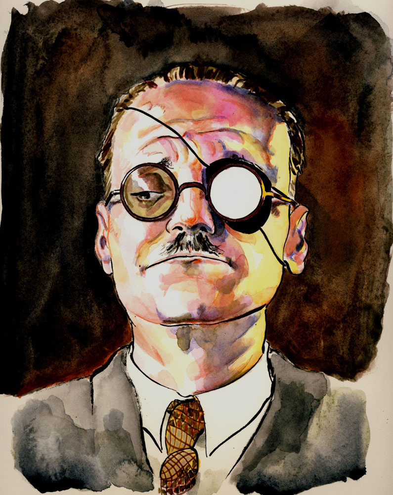
The chief mate of the Pequod was Starbuck, a native of Nantucket, and a Quaker by descent. He was a long, earnest man, and though born on an icy coast, seemed well adapted to endure hot latitudes, his flesh being hard as twice-baked biscuit. Transported to the Indies, his live blood would not spoil like bottled ale. He must have been born in some time of general drought and famine, or upon one of those fast days for which his state is famous. Only some thirty arid summers had he seen; those summers had dried up all his physical superfluousness. But this, his thinness, so to speak, seemed no more the token of wasting anxieties and cares, than it seemed the indication of any bodily blight. It was merely the condensation of the man. He was by no means ill-looking; quite the contrary. His pure tight skin was an excellent fit; and closely wrapped up in it, and embalmed with inner health and strength, like a revivified Egyptian, this Starbuck seemed prepared to endure for long ages to come, and to endure always, as now; for be it Polar snow or torrid sun, like a patent chronometer, his interior vitality was warranted to do well in all climates. Looking into his eyes, you seemed to see there the yet lingering images of those thousand-fold perils he had calmly confronted through life. A staid, steadfast man…

Those who have read the novel before know that Starbuck is the one man most qualified to stand against Ahab, to block his mad, monomaniacal mission and thus save the lives of everyone on board the Pequod, and yet he fails repeatedly to do so. Starbuck is no coward, yet he seems to lack the vision necessary to see beyond his narrow role as first mate, as Ahab’s subordinate, and as a crucial cog in the orderly running of the ship. While Starbuck almost takes that final step, and even contemplates murdering Ahab, he stops short. Not only does he lack the support of the crew, he feels bound by his duty to the ship and to Ahab and sees breaking those obligations as perhaps a crime worse than the mad pursuit of what he feels is a dumb beast. Starbuck was, for me, the easiest to see, and the easiest to illustrate. Beginning with his “long, earnest” lines and his almost perfect subservience to Ahab, I saw Starbuck as Ahab’s sword. A lean blade of a man, there to further the captain’s will. A perfectly forged tool, balanced, lethally effective, and yet lacking in any real independence. I gave Starbuck the sober grays and blues of the stormy New England sea, an odd radio antenna to signify his near total control by Ahab, and two forward looking eyes on his blade-like face to demonstrate his blindness to alternatives.

Stubb was more complex, and more personal. To me, Stubb’s near constant joking seemed something that masks a deep fear, a terror of accepting reality. At his heart, I have always thought of Stubb as little more than a coward. Melville writes…

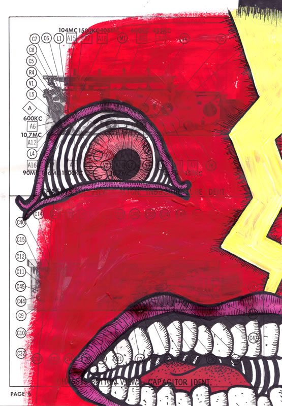
Stubb was the second mate. He was a native of Cape Cod; and hence, according to local usage, was called a Cape-Cod-man. A happy-go-lucky; neither craven nor valiant; taking perils as they came with an indifferent air; and while engaged in the most imminent crisis of the chase, toiling away, calm and collected as a journeyman joiner engaged for the year. Good-humored, easy, and careless, he presided over his whale-boat as if the most deadly encounter were but a dinner, and his crew all invited guests. He was as particular about the comfortable arrangement of his part of the boat, as an old stage-driver is about the snugness of his box. When close to the whale, in the very death-lock of the fight, he handled his unpitying lance coolly and off-handedly, as a whistling tinker his hammer. He would hum over his old rigadig tunes while flank and flank with the most exasperated monster. Long usage had, for this Stubb, converted the jaws of death into an easy chair. What he thought of death itself, there is no telling. Whether he ever thought of it at all, might be a question; but, if he ever did chance to cast his mind that way after a comfortable dinner, no doubt, like a good sailor, he took it to be a sort of call of the watch to tumble aloft, and bestir themselves there, about something which he would find out when he obeyed the order, and not sooner.

What, perhaps, with other things, made Stubb such an easygoing, unfearing man, so cheerily trudging off with the burden of life in a world full of grave peddlers, all bowed to the ground with their packs; what helped to bring about that almost impious good-humor of his; that thing must have been his pipe. For, like his nose, his short, black little pipe was one of the regular features of his face. You would almost as soon have expected him to turn out of his bunk without his nose as without his pipe.

True, there is little there, or even in the remainder of the novel, to paint Stubb as a coward but it is a feeling I have never been able to lose. Stubb’s stubborn refusal to treat matters of life and death as anything other than a joke has never seemed to me to be carefree or valiant. Rather, it is an unwillingness to accept and to engage with the realities of a dangerous life. Nothing communicates cowardice better than the color yellow, so Stubb comes complete with yellow streaks down his head and back. The pipe is there too, of course, as it must be. And it is great fun to draw. But at all times, Stubb hides the yellow cowardice behind him out of sight if he can. He is one-eyed, since he can only see the world in one way, as a joke.

Flask is perhaps the least developed and most one dimensional of the mates. A small, furious man with a monstrous yet hilarious temper. Melville describes him thus…

The third mate was Flask, a native of Tisbury, in Martha’s Vineyard. A short, stout, ruddy young fellow, very pugnacious concerning whales, who somehow seemed to think that the great Leviathans had personally and hereditarily affronted him; and therefore it was a sort of point of honor with him, to destroy them whenever encountered. So utterly lost was he to all sense of reverence for the many marvels of their majestic bulk and mystic ways; and so dead to anything like an apprehension of any possible danger from encountering them; that in his poor opinion, the wondrous whale was but a species of magnified mouse, or at least water-rat, requiring only a little circumvention and some small application of time and trouble in order to kill and boil. This ignorant, unconscious fearlessness of his made him a little waggish in the matter of whales; he followed these fish for the fun of it; and a three years’ voyage round Cape Horn was only a jolly joke that lasted that length of time. As a carpenter’s nails are divided into wrought nails and cut nails; so mankind may be similarly divided. Little Flask was one of the wrought ones; made to clinch tight and last long. They called him King-Post on board of the Pequod; because, in form, he could be well likened to the short, square timber known by that name in Arctic whalers; and which by the means of many radiating side timbers inserted in it, served to brace the ship against the icy concussions of those battering seas.

Notice that Flask, too, is shown to be something of a jokester. Yet his temper, his hatred of the whales, his view of the great beasts as something that had “personally and hereditarily affronted him” casts his humor in a vastly different light than Stubb’s. Flask lacks some of the details of the first two mates, being depicted as short, stout, ruddy and pugnacious. To me though, these words conveyed magnitudes and Flask ended up being short, stout, hopefully ruddy, and with great waves of flaming anger radiating from his tiny musket ball-shaped skull…

 Clad in a greatcoat the color of dried blood, Flask’s great eyes stare furiously forward, searching for whales to summarily slaughter. I chose this piece of found paper very careful as well for the heading “The parts of a pattern.” After all, what else are the mates, if not pieces of the pattern of the novel? In spite of their humanity, each functions more as a symbol, almost a set piece, designed to define or contradict Ahab. Their roles, their lives, are unimportant. How they function in the hands of Ahab, whether or not they further his mad schemes or obstruct them in some way, that is all that counts. The pieces are slowly falling into place for the great voyage.

(I had originally meant to post this almost a week and a half ago. Numerous daily life obligations, technical difficulties, and everything else under the sun conspired to keep me away. I hope to remedy that this week with 3 or 4 more posts, if you can tolerate that. Also, Daryl, I owe you an email which will arrive no later than tomorrow. I don’t expect to be home until around 9 this evening, and then I need to finish today’s illustration. As Melville so succinctly put it, “Oh, time, strength, cash and patience!”)

Illustrating ‘Moby-Dick’ – the Pequod and others

For some reason, even though I have read the novel multiple times, Melville’s description of the Pequod surprises me every time. I’ve seen so many pieces of historical nautical and whaling art that eventually the ships all seem to look rather similar. The same sort of planked sides, railings along the deck, lots of ropes and masts and so on. Honestly, this kind of imagery is now so common to most people that it’s not uncommon to see it on everything from beer bottle labels to tractor trailer trucks.

I think most readers come to the Pequod expecting just that same kind of beer bottle label, tractor trailer truck wooden sailing ship. Something they, in their mind’s eye, can see so clearly that the mere presence of a rather detailed description can seem a little surprising. It’s the nature of that description and those details though which always surprises me and ignites my imagination. For rather than a simple, dull whaling vessel, Melville describes the Pequod as “a ship of the old school, rather small if anything; with an old fashioned claw-footed look about her.” Let that sink in for a moment. “Rather small, if anything…” Small! Given its central role in a story as massive, as epic, as Biblical in scope as Moby-Dick, who would imagine that the outer boundaries of this wooden island that becomes the sailors’ entire world would shrink to the size of a “rather small” ship for years on end?

Melville then goes on at length about her “antiquities” such as the bearded bows, the stiff Japanese masts standing up like the “spines of the three old kings of Cologne,” her ancient decodes wrinkled “like the pilgrim-worshiped flag-stone in Canterbury Cathedral where Beckett bled” and so on. But then it starts to get really interesting, and the Pequod begins to seem a thing of fantasy. Melville describes how Peleg has “built upon her original grotesqueness, and inlaid it, all over…” This Pequod is “appareled like any barbaric Ethiopian emperor…a thing of trophies. A cannibal of a craft, tricking herself forth in the chased bones of her enemies.” Now let the mind slowly turn, imagining a machine built for the sole purpose of sailing the seas, battling whales, and rendering them into oil. Take this machine and inlay it with grotesque designs. Upon those inlays, set the bones of the very leviathans the machine has slain. A magnificent image should even now be forming in your mind.

Melville finished the description beautifully by describing how these same whale bones and teeth are not just grotesque, not simply design elements, and not even just trophies of the Pequod’s brutal hunts, but functional tools and devices themselves. The bulwarks are garnished “like one continuous jaw, with the long sharp teeth of the Sperm Whale, inserted there for pins, to fasten her old hempen thews and tendons to.” And the all important tiller is “in one mass curiously carved from the long narrow lower jaw of her hereditary foe.” The very jaw of a whale steers that same ship which hunts and destroys whales. The whole, beautiful, grotesque paragraph concludes with the line “A noble craft, but somehow a most melancholy! All noble things are touched with that.” Quite a description and a rather daunting task.

As always, when beginning an illustration, I simply unmoor my mind and let thoughts and images roll unbidden through it. Again, betraying my admittedly less-than-fine art background, my first thoughts were of the astonishing pen and ink art of Ian Miller, particularly his spot illustrations for the early mass market paperback edition of Michael Crichton’s Eaters of the Dead, the beautifully stylized comic art of Philippe Druillet, and, for some reason, the ship that Elric, Corum, Hawkmoon and Erekose sailed on in Michael Moorcock’s The Sailor on the Seas of Fate.

An aside here. When Daryl invited me to post on this blog, I was honored but nervous. After several posts, those feelings remain. I have been awed by the level of discourse and critical analysis evident in so much of this writing. At times I worry that these crude simple illustrations of mine as well as my own level of engagement with the novel and its themes seem pedestrian at best and immature at worst. And in this post, given my own comparison of the Pequod to a ship from a 1970s pulp fantasy novel series as literarily complex as Conan and, well, you can probably understand some of my nervousness. Nonetheless, one of the things which has sustained me through 274 pieces of art and counting has been an honest commitment to my own personal vision uncluttered by deconstruction or comparison to the greater body of Melville-related art. I’ll leave that part to the experts.

So with Miller, Druillet and Moorcock in mind, I began to craft my own Pequod. Again layering the images over an electrical diagram, I started with a ballpoint pen mostly because I wanted the color of the ship to stand out just a bit against the color of the background. I knew I would have a dismal time of it if I tried to keep things realistic, so I again threw all caution to the wind and drew the ship exactly as I saw it. I knew it would have planks and masts and decks and chains but the rest was up to me. I wanted my Pequod to seem savage, barbaric, exotic, and alive. An old, wily, hungry, jaded killer. Nothing about the Pequod seemed to me to be gentle, kind, or even necessarily noble. It was a creature of function, every line and every element had to contribute to creating an image of violence and predation. It had to be squat, rather ugly, yet still lethal and fearsome. Here’s what resulted…

Later I had the opportunity to expand on the details of the craft so I chose to rather elaborately highlight the strange sea beast skull that I had adorned the prow with…

Even though I’ve only been able to lavish this level of detail on the Pequod in two pieces, I have enjoyed the task of visualizing each of the ships described in the text so far. Here is the Goney…

…and here is the Town-Ho.

And I look forward to the Jeroboam, the Rose-Bud, the Bachelor, and of course the doomed Rachel. But those are stories for another day.

Illustrating ‘Moby-Dick’ – page 030

And now we come to it. My first whale. I suppose, for good or ill, I have never outgrown some of my childhood. Even now, at the decrepit age of 41 (!) I am still fascinated by monsters. More specifically, drawings of monsters. Monster art. Anything visual that’s monster related. As I’ve grown older, my tastes have broadened quite a bit and now it takes far more than a simple Godzilla film or drug store comic book to thrill my eye. Still, for me, it’s generally still all about the monsters, and I mean that in the simplest, purest, truest, and most genuine way.

I think that the idea of monsters is still a part, at least, of what draws many of us to Moby-Dick. Certainly the novel is far more complex, yes, but at its heart, the duel of whale and man, Ahab and Moby Dick, is a part of what starts our hearts pounding and our minds racing. So for me, an aficionado of the leviathans of air, land and sea, the prospect of embarking on an illustration project where I would be able to draw monster after monster after monster was one I found almost irresistible.

Once again, I knew I didn’t want to do the expected. There have already been enough staggeringly brilliant artists such as Rockwell Kent and Barry Moser, to name just two, who have lent a soberly powerful realism to this yarn of men and monsters. To me, the fact that these artists were able to depict the whales, men and ships of the story in much the way as they actually appear in reality while still creating thrilling and fabulous images is nothing short of miraculous. I have very real doubts about my ability to depict anything realistically, and on the few occasions when I have tried to do so, the results have been dull at best and positively banal at worst.

This freed me to cut loose the moorings and let my mind explode. I could draw any whale in any medium any way that I wanted. The mythical and Biblical underpinnings of the novel were enough, I thought, to give me some credibility in sailing the seas of fable and fantasy to dredge up these ideas. So again, a lifetime of comic books, videogames, fantasy art, cartoons, science fiction and colored pencils would swirl together and from that alchemical brew provide a bestiary I hoped would thrill me to the end of my days. The excitement was growing. My first whale!

The line I chose was from page 30 of the Signet Classics paperback edition, and I specifically looked for this opportunity so that I could practice a bit before tackling Moby Dick himself. This line would give me an opportunity to start working out some of my ideas and building my bestiary of leviathans. The line comes as Ishmael lounges in the Spouter Inn eating breakfast and staring about him at the panoply of seasoned salts, sailors and harpooneers. He, like me, seems to marvel at these men and the deeds that they are capable of, curiously contrasted by their almost meek silence at dining in the company of strangers. Ishmael remarks “Yes, here were a set of sea-dogs, many of whom without the slightest bashfulness had boarded great whales on the high seas—entire strangers to them—and duelled them dead without winking…” That was more than enough to fire my imagination. The bravery, the martial spirit in that line! These men had “boarded great whales on the high seas!” I’ve had a hard time stepping out of a secured canoe onto a pebbly but very stable shore, so I can’t imagine the skill and dexterity it took to “board” a great whale writhing in its death throes on the crashing waves! And then these men had “duelled them dead without winking.” Again, the courage! Or insanity? Probably both, but isn’t that paradox almost always a quality of the best heroes, from Gilgamesh to Theseus to O.M.A.C.? I liked also how that line alludes to the honor and dignity of whaling. These sea battles were not murder, they were duels. There were rules to be followed. Codes of conduct to be honored. The whale was a terrifying and murderous foe, but one to be treated with respect and dignity.

With all that in mind, the image I finally depicted leapt to mind almost immediately. That giant, rolling, baleful eye, preposterously bigger than the harpooneer himself. I wanted the harpoon to look like the death dealer that I knew it to be, so rather than attempt something realistic I remembered the scalpels we used to eviscerate the fetal pigs I studied in biology. The harpoon became a smoldering black scalpel poised menacingly over that fragile eye. The injury to the eye motif! The harpooneer I was especially fond of, towering implacably on the head of the leviathan, unbowed, unmoving, frozen in that single moment of time before delivering the deathblow. Careful viewers will notice the pink froth from the whale’s spout, showing the beast to be already gravely wounded and fighting to its last breath.

Sometimes, with these Moby-Dick illustrations, there are layers of meaning. Hidden symbols, personal and otherwise. But sometimes, it’s just men and monsters, sailors and whales. And those are often the most fun to make. I hope you like this one as much as I do.

Of Course You Can’t Trust Him—He’s Narrating

“Art, whose honesty must work through artifice, cannot avoid cheating truth.”

Adrienne Rich.

It’s funny the way this book works on me: It spends 35 chapters deferring any revelations on the plot, and just as it finally establishes what’s really at stake, I go haring off after the narrator. Specifically, I want to look at the way our whole second section of the book communicates the extent to which the story is mediated through Ishmael’s narration.

Obviously, I’m not saying anything controversial when I note that no narration can be taken at face value. For all that some literature tries to pretend otherwise, there is no such thing as pure, direct truth in any narration; narration is always the result of choices and omissions that inevitably shape it. (Like I said, not controversial.) But that doesn’t mean there’s nothing interesting in the ways a narration differs from The Truth. And in Ishmael’s case, we get such a self-consciously artificial narration that I think it fairly makes the case for meaning as mostly constructed, rather than transcendentally existent.

Paul carefully traces the buildup of suspense about Ahab, and I agree with him, but I think it’s also important to recognize it as part of Ishmael’s narrative strategy. Melville foregrounds the mediated nature of the book by beginning with a narrator who refuses to vouch for the name he gives us. This is explicitly going to be Ishmael’s arrangement of events and his conclusions on their import. Paul describes Ahab as Melville’s “master creation,” which is true, but Ahab is only ever depicted as Ishmael’s creation. The whole book is Ishmael’s telling, the whole story Ishmael’s dramaturgy.

And I use the word “dramaturgy” advisedly—chapters 36 through 40 are all explicitly theatrical. “The Quarter-Deck” (ch. 36), which is by far the most eventful and dramatic chapter up to that point, begins with a stage direction. Then we get three monologues and an unwelcome premonition of Ulysses‘s interminable “Circe” episode, fully formatted as a play. At first I found this chunk of text almost inexplicably strange. I went along for the ride and enjoyed it, but I didn’t know where it came from. Then I looked back and saw that Ishmael had been patiently laying his groundwork for a couple dozen pages at least. Chapter 29 is the first with a stage direction (“Enter Ahab; to him, Stubb”), and as a title, no less. Two pages later comes the “Cetology” chapter (of which more anon)—which truthfully doesn’t much advance my dramaturgy argument, although it does foreground the artificiality of the narrative (that wasn’t the anon I was talking about)—and then at the end of chapter 33, “The Specksynder,” Ishmael gives us a straight-up statement of his mission:

Nor, will the tragic dramatist who would depict mortal indomitableness in its fullest sweep and direst swing, ever forget a hint, incidentally so important in his art, as the one now alluded to.

But Ahab, my Captain, still moves before me in all his Nantucket grimness and shagginess; and in this episode touching Emperors and Kings, I must not conceal that I have only to do with a poor old whale-hunter like him; and, therefore, all outward majestical trappings and housings are denied me. Oh, Ahab! what shall be grand in thee, it must needs be plucked at from the skies, and dived for in the deep, and featured in the unbodied air!

“I will invent what I have to,” Ishmael says, “to tell the story I want.”

And then a whole chapter that he must have invented! “The Cabin-Table” (ch. 34) describes a whole scene that Ishmael is forbidden to attend. He gives himself a possible out with a throwaway line about “peep[ing] at Flask through the cabin sky-light,” but I’m not convinced. (Chapter 35, “The Mast-Head,” avails me nothing in the line I’m taking, so I have nothing to say about it outside these parentheses.) After all that preparation for the dramaturgical angle Ishmael intends to approach on, I shouldn’t really have been surprised to see overt drama.

Now: “Cetology.” I love this chapter, because it’s so assured and almost absurd at the same time, and because it’s so obsessively detailed, and because it’s so delightfully bibliophilically artificial. The man categorizes whales by size like paper, and breaks his categorization down by books and chapters. The note on the classification scheme is a pure pleasure: “Why this [Octavo] book of whales is not denominated the Quarto is very plain. Because, while the whales of this order, though smaller than those of the former order, nevertheless retain a proportionate likeness to them in figure, yet the bookbinder’s Quarto volume in its diminished form does not preserve the shape of the Folio volume, but the Octavo volume does.” The whole scheme is arbitrary; Ishmael announces a definition of “whale,” then proceeds to lay down a division without any express authority. It’s pure ipse dixit, presented as science. This cetological plan is only barely more organized or sensible than the classification in the Celestial Emporium of Benevolent Knowledge. If Moby-Dick, as I’ve asserted before, wants to be about everything, within that ambition is an anti-totalizing recognition that meaning is always constructed, no matter how comprehensive it aims to be. The “Cetology” chapter stands as a perfect symbol of that tension, which is why it’s always meant so much more to me than just a dry taxonomy.